Showing posts with label interior. Show all posts

Thursday, August 22, 2013

DIY: Ombré stairs!

Ok my friends... It's been a long time coming- but I'm ready to share.  
Behold! The first DIY post from our crazy home remodel project...  Emphasis on the crazy.


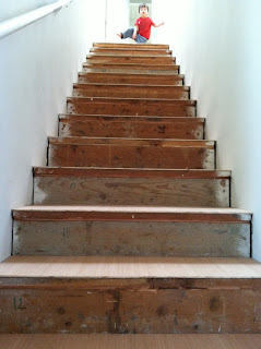
Here's Elliott modeling the wreck we were left with after ripping out that nasty carpet
My dad was kind enough to drive up from San Diego and lend a little experience and expertise to our otherwise fly by the seat of our pants/make it up as we go - construction philosophy.
It was his idea to trim the overhang (a painstaking job) and add a rounded, finished trim piece to the edge.  When I questioned the extra work and additional cost he said: "Uhhh... I'd have a hard time putting my name on it with that big gap you've got on there now."  Touché, dad...  Touché.
I'll spare you the sweaty guys sawing and bending over bit and move straight on to the pretty part.  :)


Ok, so this is where I took over the job.  I had really been wanting to try an ombré staircase, and decided to tackle it yesterday while Elliott napped.  HA!  Wishful thinking on my part.  This project was about 10,000x more intense than I expected.  Plus you can always count on me to be impatient and ill-prepared, but... ONWARD HOOOO!!!

After debating my color options right down to the moment I put brush to board, I decided on a pinkish/coral gradient.  I went from dark at the bottom to light at the top to give it an enhanced ascending effect.  The skylight at the top of the stairs was kind of the cherry on the cake for this effect- providing a great, bright white quality as your eyes go up.  Hey, did you know that each and every stair in our house is a unique and special snowflake with totally irregular dimensions, bumps, and divets?  Yeah, we didn't either.  Jeff and my dad measured each one individually, cut them, ground them, filed them, and cut a corresponding face board, marked with a number (my idea) to make things easier when matching them up.
   
After a lot of mixing trial and error, I went the Dixie cup route.  13 faces, 13 Dixie cups.  Beginning with a deep, vibrant coral red which fades to a barely-there shade of pink at the very top step.  I used our white house paint as a base in each cup and added a true red in varying amounts.  I laid the boards flat, and went about painting them in sequence.  The first result was a little too clean and looked more like a color-block than the subtle ombré fade that I was going for.
  
It took me a good hour and a half (and Elliott waking up and walking over the wet boards twice), to figure out that I needed to ignore the individual boards and treat them as one big canvas.  
Painting over the gaps and letting each one mix and fade a bit into the next really made all the difference.  I got the exact vision I had for these stairs in my head.  If you try it, keep a cup of water handy for dipping and blending.  

The end result.  I'm in love.  James thinks it looks like a sunset, and I think that's a huge compliment.  

Aaaand this is what it's all about... The before and after!  


WOO HOO! *cheerleader jump*


Tuesday, June 4, 2013

Let the pinning commence!

Ok my friends... I've finally organized and uploaded all of my home inspiration photos on pinterest!  YAY!!!  Every day that we get closer and closer to our new home, makes us more and more excited.  I  can't wait to get in there and start working on it.  We're really hoping for a breezy, open, and serene feeling in the house, and these inspiration photos I've been collecting totally nail the look.  I think they're the perfect combination of modern and comfortable.  Clean and fresh, but not too fussy, and just the right amount of quirk.  You know, I'm all about the quirk.  If you have a minute, pop on over to my pinterest page and take a look at the Home Decor board.  I'd love to know what you think.  


P.S. Here's a sneak peek of the board: 

Tuesday, July 31, 2012

Home Inspiration, Oh you Swedes...

HELLO, GORGEOUS!
That's what runs through my head when I look at these photos.  Can you imagine waking up in that bed in the morning, trudging down the bright hallway, passing by the wall of books, and plopping down to enjoy the endless sunlight?  Seriously, is there a single spot in this entire home that isn't full of light?  This is the sort of place that helps the inhabitant paint better, write better, be kinder, healthier, and generally more amazing.  I'm so ready to move in.  
What do you think, Sahnzy?  Are we up for Sweden?

Tuesday, July 10, 2012

Home Inspiration, bright white + full of light...

I'm of the opinion that white (and nearly white) in the home is hit or miss.  

Depending upon the way it's used, the objects surrounding it, and the way it's lit... white can be austere, harsh, or just plain un-welcoming; however, it can also be clean, simplified, and help put your mind at rest.  When my mind is at rest, I feel more open to epiphanies and much more likely to stumble upon creativity.  But I never consciously realized how cozy white could be until tonight.  While randomly sorting through the "Home Inspiration" folder on my desktop, I couldn't help but notice my own predilection for white in the home.  

I've rounded up just a handful of the images for you here, and found several cohesive elements that help tip these room from severe to serene.  Notably: Furs, plants, soft textiles, whimsy, natural light, woodgrain, and warm neutrals.  You'll find nearly all of those elements in each of the images below.

Fur.  
From a shaggy dog, to a cowhide, wolf pelts, and lots of sheepskins...  cozy, natural elements, such as furs, instantly soften edges and warm the rooms they occupy.  
Ahhh, natural light...  
Nothing beats it.  Nothing else even comes close.   It's that gorgeous diffused glow that seems to illuminate inanimate objects from within.  It flatters, feeds, and helps us function.  Even better?  It's free!

Textiles. 
Look at all the textiles at work above and below... a Kilim rug, embroidered woolen wall tapestry, pelt on the floor, throw blanket on the mid-century chair, and fluffy duvet, act as an invitation to sit down, snuggle up, and ahhhhh... relax.  Note, the whimsical animals in the tapestry.
Woodgrain + Plants.
The natural greens of plants instantly sets a mind at ease.  The warmth of woodgrain and straw help soften the hard lines of this very contemporary room.  Note; the whimsy of the sheepskin pillow.
Whimsy.
I love the unexpected duo of bathroom and bedroom sharing a space.
Warm neutrals: Copper, linen, leather, straw, rust, taupe, and even worn-out ballet slippers are the perfect accompaniment to a shocking true white... creating a comfortable balance and toning down the austerity, without losing the wonderful sense of clarity that white creates.  Can you find the whimsical element in this photo?  It's got ears!


So there you have it...  my white moment.  What's inspiring you right now?  


Monday, June 11, 2012

Home Inspiration... Taylor Tomasi-Hill


I know this looks really basic, and you're thinking... huh?  

But the truth is, I love the freshness of this happy little spot in Taylor Tomasi-Hill's NY kitchen.  Look at the stark, STARK white and how the pinks and reds just jump off of it.  The plants and framed snapshot really help to soften the look.  And the silly red ants, countertop taxi planter, and goofy fly-swatters tell us that this is a fun, whimsical space.  You know, I'm all about the goofy and whimsical...  Oooh, and that darling, classic checkerboard floor?  It reminds me of my elementary school (built in 1835).  

What I want to know is... where in New York did she find that flood of natural light?!  SO beautiful.  And can we just talk for a minute about Taylor's amazing hair?  She famously refuses to cop to her colorist, but dang- if that doesn't give you the "maaaaybe I could pull off red" bug...  I don't know what. 


Taylor's Current Elliott Leopard "Stiletto" denim available here.


Tuesday, May 22, 2012

Home Inspiration...


I'm loving the pretty, graphic paper peeking out from behind the shelves in this photo.
What a neat way to draw the eye back, behind the items.  It seems like it could easily look like 
a jumbled mess of clutter, and too busy... but with all of the white - and the great pops of pink
and blue, I think they pulled it off beautifully.


Here's how I used busy patterns in my own teeny kitchen.  

The pretty, statement-making wallpaper is actually just GIFT WRAP from Paper Sky!
It went on super quickly and easily with a small paint brush, and a little Mod-Podge. 
The best part?  When a project is this simple, and inexpensive- you can swap it out as often as you please.

Perfect medicine for those impulsive moments when my redecorate-disease is acting up and the only cure is to move a couch, paint a wall, or break out the Feng Shui books.


Friday, April 20, 2012

Periodical love...

I've been thinking a lot about magazines lately.  

I think it drives Jeffrey crazy, but I save them.  Not in the "collector" kind-of way, but in the dog-eared corners, post-it notes on pages, for reals reference library sort of way.  Last week at Ruby Rose, Stephanie and I were waxing poetic about missing Domino, loving Anthology magazine, and our mutual bewilderment of its elusiveness in town.  I mean really, Barnes & Noble, you can carry 40 varieties of "Tattoo Culture" magazines, but not a Made in SF quarterly design bible?  For shame!

Anyway, I thought I'd share a little run-down of my magazine library and how I've come to love the ones I do.

This is a fantastic UK publication which focuses on modern interior design, and features excellent home tours.

2. Dwell
I remember how long-coming and refreshing it felt to open that inaugural issue of Dwell, and even now I rarely skip an issue.  It's such fabulous eye-candy for anyone with a pulse on clean, modern architecture.  Floor plans, home tours, green innovations...  I truly love it.

The brainchild of Momofuku's David Chang, this magazine is only on its third issue, but an instant favorite.  Amazingly candid interviews with top chefs, specialty recipes, food sourcing and provenance... and editorial by the bad boy himself, Anthony Bourdain!  Super fun reading for foodies.  Not for the squeamish.

I've yet to find an American equivalent to this beautiful French home and craft magazine.  Entirely in French, but guess what... photos translate effortlessly.  Each issue features darling tutorials and excellent DIY's.  Editorials focus on Seasonal decor, DIY fashion, recipes, and entertaining.  Bonus points: Animals from Deyrolle figure prominently and often.  Ahhh... the perks of Paris.  


Is this embarrassing to admit?  I feel like maybe this is the nerd who snuck into the bunch- but OH, do I love this magazine.  There's a reason why it's been around for ages, and why people bequeath their entire estates to its preservation.  National Geographic is so full of human interest, exotic locales, and mind-blowing imagery - it makes everything else just seem trivial and slight.  Ok, maybe I just answered my own question...  This may well be the grandad of published cool.

6. Vogue
Say what you will about Anna Wintour, but she and Grace and Andre keep this iconic magazine relevant, ahead of the curve, and honest-to-God glamourous.  More than any other, these are the magazines I flip through for years and years and reference again and again.  Classic.

New classic.  Can't live without.  Just. So. Good.  Which of course makes me worry for its future.  Somehow the best of the best new start-up magazines in recent years have folded.  I have high hopes for this one, and fingers and toes crossed for its survival.  I love that some of my very favorite bloggers are contributors.  I love the photos, the stories, the design ideas...  now to find a local distributor.  

8. Cookie
FABULOUS.  Functional.  Defunct.  This magazine was an all-time favorite.  I would be giddy with joy when new issues arrived at my doorstep.  Wonderful recipes (including great variations depending upon ingredients on-hand), parenting and relationship advice, real moms, real homes, children's fashions, DIY's...  Even years later, the issues are relevant and wonderful.

What about you?  Are you a magazine fan?  Which are your favorites?


Wednesday, April 18, 2012

Home Reference: Back yard pool...

I keep a little folder on my desktop entitled: "Home Reference".

In it, I collect images of homes and architectural details that have inspired me.  Jeff suggested that I share them here... so, here we go!  I thought the image below would be a perfect starter to acquaint you with the series.  At first glance, you'll notice that uhhMAAYziiing pool, nestled perfectly into the narrow yard.  Super cool, right?


But look a little closer...  see the bedroom upstairs?  The cushy sitting area at the bottom of the staircase?  The open floor plan downstairs?  The house is small, but they've opened it up as much as possible.  With an entire wall of glass, and accordion doors to blur the divide between indoor and outdoor space, they've made it look (and I'm assuming, feel) big and highly-functional.  Notice how the outside range, connects almost seamlessly with the indoor cooking area.  I love this.  I'll admit, I'm not crazy about avant garde rooflines, but the corrugated tin makes up for the pretention of that dramatic angling.  What do you think?


Photo by James Geer